Mossbrook: directing a cozy world around the core loop
A witch’s potion shop, readable ingredients, and a world that grows with the player. The creative priorities behind Mossbrook’s visual ambition.
THE SHORT ANSWER
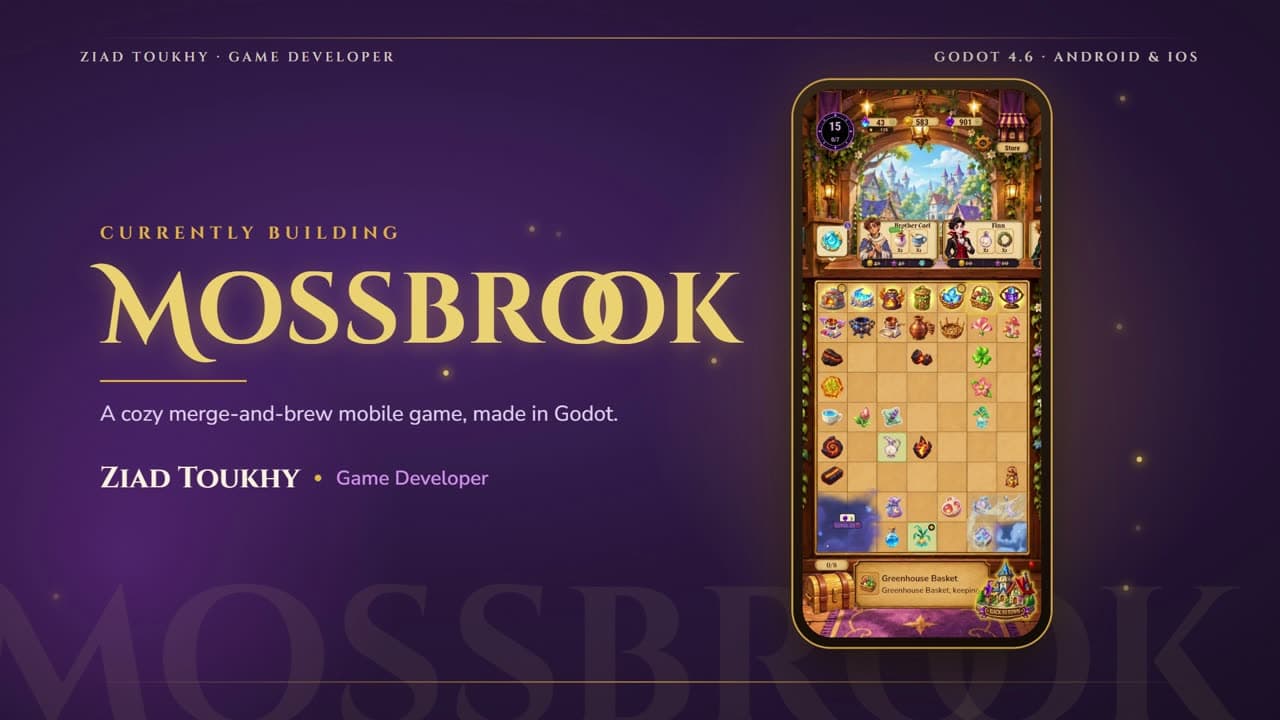
Mossbrook is a cozy merge-and-brew mobile game about restoring a young witch’s potion shop. Its art direction needs to support readable ingredients, satisfying progression, and a storybook atmosphere while keeping the repeated actions easy to understand.
A clear premise gives the visuals a purpose
Mossbrook is my own game-direction project: a cozy mobile game built in Godot for Android and iOS. The premise follows a young witch restoring a run-down potion shop in the village of Mossbrook. Players tap generators, merge ingredients, brew potions, and fill villager orders.
That premise is useful because it connects a repeatable interaction loop with a place the player can care about. Ingredients and potions give the mechanics a tangible identity. The shop gives progression a visible home. The village provides a context for the people asking for those potions.
The public portfolio describes a storybook-witchcraft direction. This article explains the creative priorities that follow from that premise. It does not report player-test results or announce features beyond the project information already presented in the portfolio.
Let ingredients carry character without losing clarity
A merge game asks the player to recognize and compare objects repeatedly. If neighboring items are difficult to distinguish, charm becomes friction. A useful visual-development approach gives each object family a recognizable silhouette and then makes progression within that family legible.
Color can help, but it should not be the only difference between important states. Shape, size relationships, internal structure, and framing can support recognition. The interesting challenge is to preserve the fantasy of the ingredients while making the mechanical relationships clear.
For illustrative review purposes, place a selection of ingredients on a busy board and inspect it at phone size. Ask whether the player can distinguish families, identify important objects, and understand what belongs together. This is a recommended design check, not a claim that a particular version of the game has passed a measured usability test.
- Give object families distinct silhouettes.
- Make progression readable through more than color alone.
- Compare objects on the actual board, not only in isolated artwork.
- Let visual detail support recognition rather than obscure it.
Make restoration feel like a coherent transformation
A shop-restoration premise creates opportunities for visual storytelling. Improvements can change how the space feels, reveal something about its owner, and give the repeated loop a larger purpose. The direction needs to connect those changes so that the shop remains recognizable as it evolves.
A useful planning exercise is to describe the shop’s visual anchors: recognizable architecture, recurring materials, characteristic shapes, and a small set of atmospheric cues. Potential improvements can then add warmth or personality while preserving the identity of the location.
Restraint matters. More objects and brighter effects are not automatically more rewarding. A clear before-and-after relationship helps a player see what changed. The creative goal is a place that becomes more inviting and personal, with progression expressed through deliberate decisions rather than decoration alone.
Direct the whole experience, not individual screenshots
Mossbrook’s public project description brings together the core loop, shop restoration, monthly events, and an in-game store. Those systems have different functions, but their presentation needs to belong to the same world. Interface decisions deserve the same creative attention as characters and environments.
For a mobile project, examine representative screens at practical sizes and consider how navigation, important actions, and decorative framing interact. Godot’s interface system provides layout tools, but visual clarity still depends on deliberate hierarchy and good judgment. Technical implementation and art direction need to inform each other.
Building Mossbrook gives me a place to connect game direction, visual development, production thinking, and the player’s experience. Future journal entries can explore particular decisions as the project develops. For now, the central ambition is a coherent cozy world whose visual identity makes the core actions easier to understand and more enjoyable to inhabit.
Key takeaways
- Connect the visual identity to the repeatable gameplay actions.
- Make ingredient families and progression easy to recognize.
- Use restoration to express a coherent change in the shop.
- Review interfaces and world art as parts of the same experience.