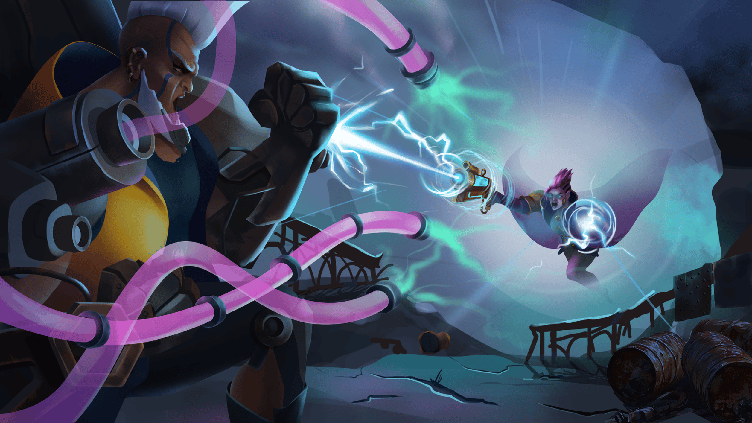
Make characters, environments, and UI speak the same language
How shared visual principles connect different art disciplines without forcing every asset to look identical.
THE SHORT ANSWER
Visual consistency comes from shared principles for shape, value, color, material, and hierarchy. Apply those principles differently to characters, environments, and interfaces according to what the player needs to understand.
Assign each discipline a role in the player’s attention
Characters often need to communicate identity and action quickly. Environments establish place, support navigation, and create atmosphere. Interfaces explain choices and feedback. Those roles overlap, but they should not constantly compete for the same level of attention.
Review a representative screen and ask what the player notices first, second, and third. If everything is calling for attention, the screen has no useful hierarchy. If the critical action disappears into the decoration, the visual language is failing its practical purpose.
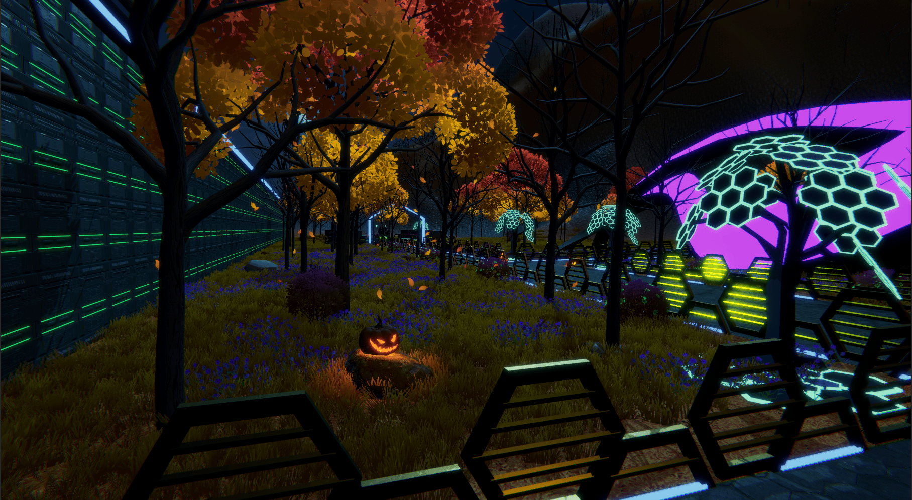
For an illustrative mobile-game screen, quieter environmental texture can create space for readable objects, while interface framing can echo the world’s shapes without reproducing all its detail. Test these relationships at real gameplay size. A close-up review tells you about craft; the full screen tells you about direction.
- Identify the primary action or information on each representative screen.
- Compare value and contrast across all disciplines together.
- Reserve visual emphasis for information that matters to the player.
- Check whether decorative detail supports or competes with that emphasis.
Build a representative set instead of separate mood boards
Separate discipline mood boards can drift because each team selects the most appealing examples for its own needs. Bring a character, an environment, an interactive object, and a UI element into one representative set. Evaluate them together before expanding the asset library.
Annotate the connections. Show how a character’s proportions relate to the world’s shapes, how palette roles carry through into interactive objects, and how the interface frames information. These annotations help artists understand the direction as a system rather than a collection of images.
When an exception is necessary, record the reason. A danger signal may deliberately break the usual palette. A temporary event may introduce a different atmosphere. Exceptions become useful when the team understands their purpose and boundaries; unexplained exceptions simply weaken the rules.
Review the game across disciplines regularly
A disciplined review rhythm catches drift as the game grows. Look at new assets alongside existing representative work, then inspect them in a screen or scene. Ask whether the addition strengthens the shared language and whether it changes the player’s understanding in an unintended way.
Avoid reducing art direction to a list of cosmetic corrections. A screen may need a hierarchy change, a simpler environment treatment, or a clearer object family. Naming the underlying issue helps the team solve the problem across multiple assets instead of repairing each symptom separately.
My work across PC, mobile, and VR connects visual development with interfaces and creative identity. For studios building a distinctive game, that cross-disciplinary perspective matters: the player experiences one world, even when many specialists create it. Sustained leadership keeps the relationships visible as the production becomes more complex.
Key takeaways
- Define shared principles rather than identical treatments.
- Assign visual emphasis according to gameplay needs.
- Approve a representative set across disciplines before scaling.
- Inspect new work in context to catch drift early.